Arvinity Studio

Should You Display Pricing on Your Website? 5 Proven Rules for Service Businesses

Should you display pricing on your website, or keep it behind a “request a quote” form? Every service business owner asks this eventually, usually after a week of discovery calls with people who were never going to pay what the work costs.

The honest answer is that hiding your price doesn’t protect your margin. It just moves the price conversation to a call you now have to take. The decision to display pricing on your website isn’t a pricing question at all — it’s a filtering question.

Here are the five rules we use to decide, plus the cases were staying quiet on price genuinely is the better call.

What It Actually Means to Display Pricing on Your Website

Most owners hear this question as binary: publish an exact number, or publish nothing. That framing is why so many get it wrong.

To display pricing on your website means giving a visitor enough financial information to decide whether to keep going. That can be an exact price, a starting-at figure, a range, a typical project band, or even a plain sentence about your minimum. All of those count.

The point isn’t transparency for its own sake. The point is that a visitor holding a number can qualify or disqualify themselves in four seconds — which is exactly what it takes to display pricing on your website in a way that earns its place.

Pricing is one layer of a larger structure. The full service business website blueprint covers where it sits relative to proof, navigation, and your booking funnel.

should you display pricing on your website — close-up of a blank price tag

Why Hiding Your Price Costs You Qualified Leads

Three things happen when a service business refuses to show any number at all.

The wrong people book anyway. A price-shopper with no budget has nothing to lose by filling out your form. They’ll find out the number on the call — the call you scheduled, prepared for, and showed up to.

The right people leave. A serious buyer comparing three providers doesn’t want a sales conversation to learn a range. Some of them close the tab and pick the competitor who told them. This is the quiet cost of refusing to display pricing on your website: you never see the leads you lost, so it never looks like a problem.

Your sales calls turn into pricing calls. Instead of discussing scope and fit, the first ten minutes go to the number that could have been on a page. Deciding to display pricing on your website moves that conversation earlier, where it costs you nothing.

None of this shows up in analytics. Traffic looks fine. Form fills look fine. The calendar is full and the close rate is terrible.

The 5 Rules for Deciding Whether to Display Pricing on Your Website

These rules assume the goal isn’t “more leads.” It’s fewer, better ones.

1. Lead With the Anxiety, Not the Number

Visitors aren’t looking for a price. They’re looking for reassurance they won’t be ambushed by one. Name the fear directly — “no surprise line items,” “you’ll know the full cost before we start” — and the number lands as proof rather than a barrier.

This reframe is the single biggest reason to display pricing on your website in the first place. The price is a trust signal before it’s a figure.

2. Show a Range, Not a Single Exact Figure

Unless your service is genuinely fixed-scope, one number is either too high for a small job or too low for a complex one. A band — “most roof replacements run $X to $Y depending on size and material” — does the filtering work without underselling a custom engagement.

Ranges also let you display pricing on your website without renegotiating every quote you’ve ever sent. You’re publishing a boundary, not a contract.

3. Anchor the Price to the Outcome, Not the Hours

A number sitting alone invites comparison shopping. A number next to what it produces invites a decision. “$X to replace the system and cut your monthly bill” reads differently from “$X for installation.”

The strongest pricing sections don’t just display pricing on your website — they explain what the money buys and why cheaper options usually cost more later.

business owners reviewing figures before they display pricing on your website

4. Name Who Your Pricing Isn’t For

This is the part almost everyone skips. A line like “if you’re looking for the cheapest bid, we’re not it” disqualifies faster than any form field, and it makes every other claim on the page more believable.

Copy that turns people away isn’t a risk to conversions. It’s the reason to display pricing on your website at all — the number does the disqualifying so your inbox doesn’t have to.

5. Put the Price Before the Form, Not After

If a visitor has to submit their details to learn a range, the form is a toll booth. Move the number above it. Let them self-select out, then ask the qualifying questions — scope, timeline, budget band — of the people still standing.

Sequenced that way, you display pricing on your website and your booking form does sales-team work before anyone picks up a phone. That’s the whole point of a conversion-focused website structure.

When You Should Not Display Pricing on Your Website

There are real exceptions, and pretending otherwise is bad advice.

Highly custom, variable-scope work where the honest range spans 10x. A range that wide tells the visitor nothing and scares off good-fit buyers. A minimum (“projects start at $X”) usually works better here than a full range.

Regulated or bid-based services where published rates create legal or competitive exposure. If your industry prices by tender, a public rate card can work against you.

Brand-new offers with no pricing confidence. If you’re still testing what the market pays, don’t display pricing on your website yet — lock the number down first, then publish it.

Outside of those cases, the reflex to hide price is usually fear, not strategy.

service business consultation where pricing was settled before the call

Common Pricing Page Mistakes

  • Burying the number three scrolls down. If a visitor came to the page for a price, make them scroll for anything but that.
  • Publishing a range you won’t honor. One “that was just a starting point” on a call destroys the trust the page bought you.
  • Listing packages nobody picks. Three tiers where two exist only to make the middle look reasonable reads as a tactic, not an offer.
  • Using “contact us for pricing” as the only answer — the phrase that tells a serious buyer you’ll be expensive and evasive about it.
  • No context around the number. A figure with no scope, no inclusions, and no outcome attached invites the exact comparison you’d lose.
  • Forgetting the disqualifier line. If you display pricing on your website but never say who it isn’t for, you’ve published a number without publishing a filter.

How This Changes by Industry

HVAC and roofing. Homeowners are primed to expect a surprise invoice. Publishing typical ranges by job type calms that before the quote request, and filters out the “just checking” callers.

Legal and professional services. Full rate transparency is often impractical, but a consultation fee, a retainer minimum, or a plain “we work with matters above $X” does most of the same work.

Coaches and consultants. This is where the decision to display pricing on your website matters most. High-ticket offers attract browsers, and a public floor keeps discovery slots for people who can actually buy.

Agencies and freelancers. A minimum project size is usually enough. Naming it publicly ends the “can you do it for $5k?” thread before it starts.

If you want to see how pricing fits into the rest of the page structure, our concept builds show the sequence end to end.

Frequently Asked Questions

Does showing prices hurt conversion rates?

It lowers raw form fills and usually raises booked, qualified calls. Those are different metrics, and only one pays you. If total lead volume is your KPI, hiding price will look better on a dashboard while your close rate quietly drops.

What if my competitors don’t show their prices?

That’s the argument for doing it, not against. When every competitor makes a buyer work to learn a number, the one who answers plainly wins the comparison before the call. It’s also the cheapest differentiator available to display pricing on your website when nobody else in your market will.

Should I use exact prices or starting-at figures?

Starting-at works for most service businesses. Exact prices work when scope genuinely doesn’t vary — a tune-up, an inspection, a fixed package. Either way, add the inclusions underneath so the number can’t be read in isolation.

Where should pricing live — homepage or its own page?

Both. A range or a “starts at” line on the homepage catches visitors who’ll never click through; a dedicated page handles the buyers who want detail. The rule is simple: if you display pricing on your website, no visitor should have to hunt for it.

Make Your Price Do the Filtering

The decision to display pricing on your website comes down to one question: do you want your site to collect leads, or qualify them? A number on the page turns passive traffic into a self-sorting funnel — and every unqualified visitor it turns away is an hour you get back.

If your site isn’t filtering, you are — and a price is the cheapest filter you can install. It’s step one of the service business website blueprint, and the same qualification logic behind our psychology-driven web design and CRO work. Want an honest read on where your current site is leaking qualified leads? Start a project and we’ll send you a breakdown within 48 hours.


Further reading on how visitors evaluate cost and trust signals on a page: Nielsen Norman Group and Baymard Institute both publish ongoing UX research on pricing transparency and buyer hesitation.

15 Website Call to Action Examples to Boost Booked Calls

If you’ve ever swapped “Contact Us” for “Learn More” and called it a CTA overhaul, you’ve been fixing the wrong problem. The website call to action examples below aren’t about clever button copy — they’re about turning your CTA into the moment a visitor decides whether they’re a fit for what you do, not just whether they’ll click.

Most service business websites treat the CTA as an afterthought. A button gets dropped at the bottom of the page, the same three words get repeated on every page, and everyone hopes something eventually converts. That’s a wasted opportunity. A CTA is prime real estate — it’s the last thing standing between a browser and a booked call, and it should be doing real work.

Below are 15 website call to action examples, organized by where they show up in the buyer’s journey — homepage, service pages, proof sections, booking funnels, and the disqualifying CTAs almost nobody uses. Steal the structure, adapt the language to your business, and pay attention to which ones actually change your booked-call rate.

What Makes a Website Call to Action Actually Convert?

A CTA isn’t just a button — it’s the point where a visitor either commits or walks away. The best website call to action examples do three things at once: state the exact next step, name what happens after the click, and quietly filter out whoever isn’t ready to take it.

Most CTA advice online stops at “use an action verb.” That’s the floor, not the strategy. A button that says “Get Started” is technically an action verb and still tells the visitor nothing about what starting actually involves — how long it takes, what it costs, or whether they’re even the right kind of client.

The website call to action examples that actually move a booked-call number share one trait: they reduce uncertainty instead of hiding it. A visitor who knows exactly what clicking will cost them — in time, money, or commitment — clicks with far less hesitation than one guessing at what’s on the other side.

website call to action examples

Why Most CTAs Fail to Convert

Before looking at better website call to action examples, it helps to know exactly where the current ones are breaking down. Three patterns show up on almost every underperforming service business website:

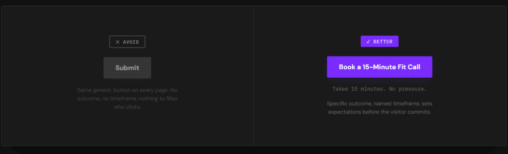
The CTA is generic. “Contact Us,” “Learn More,” and “Submit” describe an action without describing an outcome. They convert browsers and serious buyers at roughly the same low rate, because neither group knows what they’re actually signing up for.

The CTA is repeated without variation. The same button appears at the top, middle, and bottom of every page, regardless of what the visitor has just read. A CTA that ignores context is asking for a decision the visitor isn’t ready to make yet.

The CTA never filters anyone out. Most businesses are so afraid of losing a lead that every CTA is built to capture anyone willing to click. That approach fills the calendar with unqualified calls a sales team then has to filter manually — the exact job better website call to action examples are supposed to do automatically.

15 Website Call to Action Examples for Service Businesses

These website call to action examples are grouped by where a visitor encounters them — because the right CTA changes depending on how much a visitor already trusts you.

Homepage CTAs That Set the Filter Early

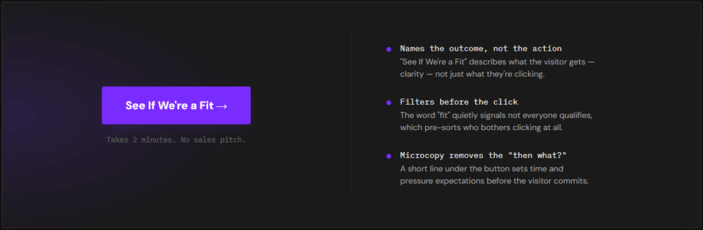
1. “See If We’re a Fit” This does more filtering in four words than most homepages do in four paragraphs. It signals upfront that not everyone qualifies, which makes the visitors who do click feel like they’re being evaluated, not just funneled.

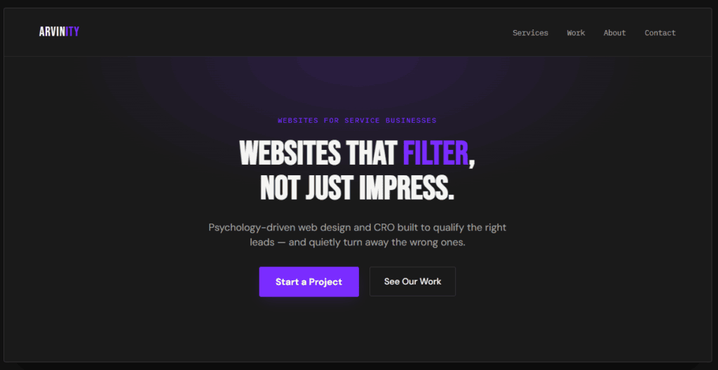
2. “Start a Project” Specific and low-ambiguity — it tells a ready visitor exactly what clicking begins, without the vagueness of “Get Started” or “Learn More.”

3. “Get Your Free Audit” Names a concrete deliverable instead of a vague next step. A visitor knows exactly what they’ll receive, which lowers the hesitation that kills generic CTAs before the click even happens.

website call to action examples

Service Page CTAs That Move Visitors Toward a Decision

4. “See Pricing & Packages” Answers the question a skeptical visitor is already asking silently. Hiding this behind a generic “Contact Us” just pushes that same question onto a call your team now has to answer live.

5. “Talk to a [Service] Specialist” Naming the role, not just “us,” makes the next step feel specific and low-risk instead of like a generic sales pitch.

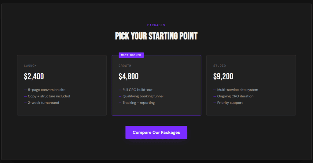
6. “Compare Our Packages” Useful when a service has tiers — it invites comparison instead of forcing a single yes/no decision, which suits a visitor still evaluating options.

website call to action examples

Proof-Driven CTAs That Build Trust Before the Click

7. “See the Results” Placed next to a case study or testimonial, this CTA leans on proof that’s already built momentum, rather than asking for trust cold.

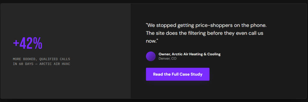
8. “Read the Full Case Study” Gives a curious-but-not-ready visitor a lower-commitment next step than booking a call — and often warms them up enough that they book anyway a few pages later.

9. “See Why [Client Type] Chose Us” Speaks directly to the visitor’s own situation instead of a generic audience, which is one of the more underused website call to action examples on service business sites.

website call to action examples

Booking Funnel CTAs That Pre-Qualify Leads

10. “Check Your Project Fits Our Scope” Sets an expectation before the click that not every project is accepted, which pre-qualifies the visitor before they’ve even reached the form.

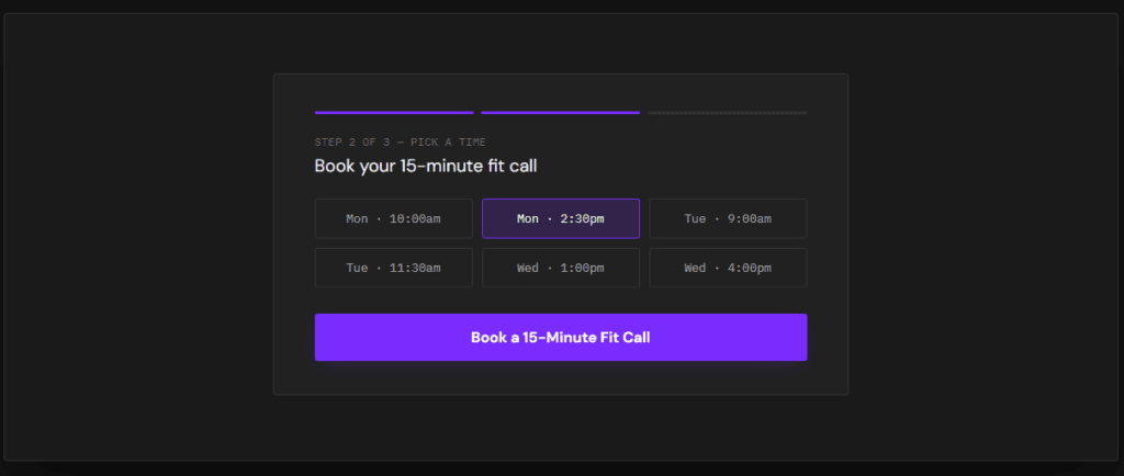
11. “Book a 15-Minute Fit Call” Naming the exact time commitment reduces hesitation more than an open-ended “Schedule a Call,” which visitors correctly assume might run long.

12. “Answer 3 Quick Questions to Book” Sets expectations that a short qualifying step comes before the calendar link — which filters out low-intent clicks without adding real friction for a serious buyer.

website call to action examples

Disqualifying CTAs That Filter Out the Wrong Fit

13. “Not Sure We’re a Fit? Check Here First” Directly addresses hesitation instead of ignoring it, and gives an unqualified visitor an honest off-ramp instead of a form they’ll abandon halfway through.

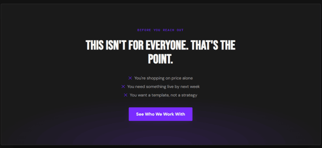
14. “This Isn’t for Everyone — See Who We Work With” One of the more counterintuitive website call to action examples on this list, and one of the highest-converting once you test it: naming who you don’t serve makes the right-fit visitor trust the rest of the page more, not less.

15. “Skip This If You’re Just Comparing Prices” Blunt, but effective. It tells a price-shopper to self-select out before they take up a form submission or a call slot meant for someone who’s actually ready to buy.

website call to action examples

Suggested image: a screenshot of a qualifying or “who this isn’t for” section, or a stock graphic searched as “website filter section design.”

Common CTA Mistakes to Avoid

Even with a strong library of website call to action examples to pull from, a few habits quietly undo the work:

  • Using the same CTA everywhere. A homepage visitor and someone who just finished reading a case study are at different stages — one CTA can’t serve both well.
  • Burying the CTA below multiple scrolls of copy. If a ready visitor has to hunt for the next step, a percentage of them leave instead of scrolling further.
  • Writing CTA copy that describes the button instead of the outcome. “Click Here” and “Submit” tell a visitor what the button does mechanically, not what they get from clicking it.
  • Never testing disqualifying language. Most businesses are too nervous to try a CTA that filters visitors out, even though it’s one of the more reliable ways to raise the quality of the leads that do come through.
  • Treating the CTA as separate from the copy around it. The sentence right before a button does more persuading than the button text itself — a strong CTA with weak setup copy still underperforms.
  • Copying website call to action examples word-for-word without adapting them. The phrasing that works for one business’s audience can fall flat for another — treat every example on this list as a starting point to adapt, not a script to paste in directly.
website call to action examples

How CTAs Should Change by Industry

Not every business needs the same website call to action examples word-for-word — the core logic stays the same, but the emphasis shifts:

HVAC and roofing businesses do well with CTAs that address cost anxiety directly — “Get a Free, No-Obligation Estimate” outperforms a vague “Contact Us” because it removes the fear of a hidden sales pitch.

Legal and consulting websites benefit from CTAs that emphasize access and speed — “Talk to an Attorney This Week” answers the responsiveness question a visitor is quietly worried about.

Coaches and consultants need the disqualifying CTAs on this list to work hardest, since high-ticket offers attract more curious browsers than ready buyers — a CTA like “See If You Qualify” filters window-shoppers before they take a discovery call slot.

Agencies and freelancers get the most mileage from proof-driven CTAs, since prospective clients are usually comparing several portfolios before they’re ready to reach out at all.

If you want to see this logic applied to full page structure — not just the CTA — our Service Business Website Blueprint breaks down where CTAs fit into the bigger picture.

Frequently Asked Questions

What’s the best CTA for a service business homepage?

There’s no single best CTA — it depends on how much trust a first-time visitor already has. Looking back at the website call to action examples above, a newer or lesser-known business usually does better with a low-commitment CTA like “See If We’re a Fit” or “Get Your Free Audit,” while an established brand with strong proof can go straight to “Start a Project” or “Book a Call.”

How many CTAs should a webpage have?

One primary CTA per page, repeated in context rather than duplicated identically everywhere. A homepage might repeat “See If We’re a Fit” after the hero, after the proof section, and at the bottom — same core action, reinforced at each point a visitor’s confidence grows.

Do disqualifying CTAs actually reduce leads?

They reduce the number of unqualified leads, which is the point — total lead volume may drop while booked-call quality goes up. It’s exactly why the disqualifying website call to action examples further up this page tend to outperform expectations once businesses actually test them. For most service businesses, fewer, better-qualified calls beat a longer list of quotes and consultations that were never going to close.

Turn These CTAs Into Booked Calls

A great CTA can’t fix a page that gives visitors no reason to trust it — but a weak CTA can absolutely sink a page that does everything else right. These website call to action examples work because each one reduces uncertainty, sets a clear expectation, or filters out the wrong fit before a click even happens. Swap even two or three of these website call to action examples in for the generic ones on your current site, and the difference in call quality usually shows up within the first few weeks.

This is the same qualification logic we build into every psychology-driven web design and CRO project at Arvinity Studio. If your current CTAs are collecting clicks but not booked, qualified calls, start a project and we’ll show you exactly where the filtering is breaking down.


Further reading on how visitors actually make decisions on a page: Nielsen Norman Group and Baymard Institute both publish ongoing UX research on CTA placement and microcopy.

Website Optimization for Lead Generation: 6 Proven Fixes to Book More Calls

Most businesses treat website optimization for lead generation as a traffic problem — more ads, more SEO, more visitors. But if your site isn’t converting the traffic it already gets, more of it just means more people leaving unconvinced, faster.

Real website optimization for lead generation starts with the site itself: what it asks of a visitor, how much friction stands between interest and a booked call, and whether the page even gives a ready buyer a clear next step. The six fixes below are where that work actually happens.

What Website Optimization for Lead Generation Actually Means

Most people hear “website optimization” and think SEO — rankings, keywords, backlinks. That’s optimization for traffic. Website optimization for lead generation is a different discipline entirely: it’s optimizing what happens after someone already arrives, so more of that traffic turns into an actual conversation.

The two aren’t in competition, but they get confused constantly, which is why a lot of businesses pour budget into rankings while the page those visitors land on quietly leaks the leads that traffic was supposed to produce. Fixing that leak is almost always cheaper than buying more traffic to compensate for it.

website optimization for lead generation

Why More Traffic Doesn’t Fix a Lead Generation Problem

A site converting at 1% needs 10x the traffic to match a site converting at 10% — and buying that extra traffic is almost always more expensive than fixing the page itself. This is the math that makes website optimization for lead generation worth doing before, not after, a bigger ad spend.

There’s also a compounding effect. Every visitor who leaves unconverted is one who’s already seen the brand and decided not to act — a much harder person to win back than someone who hasn’t seen it yet. A site that leaks leads doesn’t just waste today’s traffic; it makes tomorrow’s traffic slightly less persuadable too.

The 6-Part Website Optimization Checklist for Lead Generation

This is the order we work through on every optimization pass — each one closes a specific leak in the funnel.

1. Page Speed and Mobile Experience

A slow-loading page loses visitors before they ever see the offer, and most lead generation traffic today arrives on mobile. This is the foundation the rest of website optimization for lead generation sits on — no amount of persuasive copy matters if half your visitors bounce before the page finishes loading.

2. Landing Pages Built for One Offer, Not the Whole Business

A homepage trying to represent every service dilutes the message a paid or organic visitor actually came for. A dedicated landing page for a single offer, with everything on it pointing toward one action, consistently converts better than a general-purpose page asked to do too many jobs at once.

This matters most for paid traffic, where every visitor already clicked on a specific promise — sending them to a homepage that doesn’t immediately confirm that promise is often where the budget quietly disappears.

3. Forms That Reduce Friction Without Losing Qualification

Every extra form field costs you some percentage of visitors who won’t finish. The fix isn’t always fewer fields — it’s the right fields. Two or three well-chosen questions can raise both completion rate and lead quality at the same time, which is the actual goal of this kind of website optimization for lead generation.

4. CTAs Placed Where Buying Intent Actually Peaks

A single CTA at the bottom of a long page misses every visitor who was ready to act halfway through. Placing calls to action right after the sections that build the strongest case — proof, pricing clarity, a clear differentiator — catches intent at the moment it’s highest instead of hoping it survives to the end of the scroll.

website optimization for lead generation

5. Follow-Up Sequences That Keep Warm Leads Warm

Not every visitor converts on the first visit, and a lead capture with no follow-up plan behind it wastes most of that interest. A short, specific follow-up sequence — not a generic newsletter — keeps a warm lead engaged long enough to become a booked call instead of a forgotten form submission.

Speed matters here too — a lead that hears back within the hour behaves very differently from one that waits three days for a reply, even if the eventual message is identical.

6. Tracking and Attribution

You can’t optimize what you can’t measure. Knowing which page, which CTA, and which traffic source actually produced a booked call turns the previous five fixes from guesses into a feedback loop — this is what separates a one-time redesign from ongoing website optimization for lead generation.

Common Mistakes That Quietly Kill Lead Generation

These show up even on sites that have technically gone through a website optimization for lead generation pass at some point:

  • Optimizing the homepage while ignoring landing pages — the pages actual campaign traffic lands on often get the least attention.
  • Treating every visitor as equally likely to convert, instead of tailoring the page to the intent behind the traffic source.
  • A/B testing button colors while ignoring the actual offer, headline, or qualifying questions — the changes with real impact are rarely cosmetic.
  • No baseline conversion rate to measure against, so “improvement” is really just a guess.
  • Treating this as a one-time project instead of an ongoing part of website optimization for lead generation, revisited as traffic sources and offers change.

How This Differs by Industry

HVAC and roofing lead generation optimization leans heavily on speed and mobile experience, since most searches happen urgently, on a phone, often after an actual problem shows up.

Legal and consulting lead generation optimization depends more on the qualifying questions in the form — the goal is fewer, better-fit consultations, not maximum form submissions.

Coaches and consultants need landing pages built around a single offer far more than a general homepage, since paid traffic to a broad site rarely converts as well as traffic sent to one focused page.

If you want the full structural framework this checklist sits inside, our Service Business Website Blueprint covers it end to end — and How to Let Your Website Sell for You covers the messaging side of the same problem.

Frequently Asked Questions

Is website optimization for lead generation the same as SEO?

No — SEO is optimization for traffic and visibility in search results. Website optimization for lead generation is what happens after that traffic arrives: turning visits into qualified leads. The two work together, but a site can rank well and still convert poorly if the second half of the equation is ignored.

How often should you optimize a website for lead generation?

Treat it as ongoing rather than a one-time fix. A quarterly review of conversion data — which pages, CTAs, and traffic sources are actually producing booked calls — is usually enough to catch new leaks before they cost significant lead volume. Bigger reviews make sense after major changes: a new offer, a shift in traffic sources, or a redesign that touches the pages actually generating leads.

What’s a good conversion rate for a lead generation website?

It varies widely by industry and traffic source, which makes an industry-average benchmark less useful than your own baseline. The more useful question is whether this month’s rate is better than last quarter’s — that trend line matters more than comparing yourself to a number that may not reflect your specific offer or audience.

Start Optimizing for Leads, Not Just Traffic

Website optimization for lead generation isn’t about a bigger ad budget or another ranking push — it’s about making sure the traffic you already have has a real reason, and a real path, to convert.

This is the exact process behind our conversion rate optimization work. If you want to see where your current site is leaking qualified leads, start a project and we’ll send you an honest audit within 48 hours.


Further reading: Baymard Institute and CXL both publish ongoing research on form design, landing page structure, and conversion behavior.

How to Let Your Website Sell for You: 5 Proven Fixes

If you’ve ever thought “my website should be doing more than this,” you’re already halfway to the answer. Most service business websites sit online like a digital business card — present, polite, and completely passive. Learning how to let your website sell for you isn’t about redesigning it. It’s about giving it a job it’s currently not doing.

A website that sells doesn’t wait for a visitor to figure out what to do next. It makes the case, handles the objections, and moves a ready buyer toward booking — the same way a good salesperson would, minus the payroll. That’s the entire idea behind learning how to let your website sell for you.

What “Letting Your Website Sell for You” Actually Means

A salesperson doesn’t just describe the product — they read the prospect, anticipate objections, and steer the conversation toward a decision. A website that sells for you does the same thing, structurally: it asks itself, at every section, “what does this visitor need to believe right now to keep going?” That structural habit is really what it takes to let your website sell for you.

Most websites never ask that question. They’re organized around what the business wants to say (services, history, credentials) instead of what the visitor needs to hear, in order, to say yes. That’s the entire gap between a site that sells and one that just sits there.

Why Most Websites Don’t Sell — They Just Exist

Three reasons a website ends up passive instead of persuasive:

It was built once and never touched again. A site launched three years ago is still using the same generic copy, the same static contact form, and the same assumptions about what visitors need — even as the business and its ideal client have both changed.

Nobody owns “does this convert” as a job. Design gets a designer, copy sometimes gets a copywriter, but the actual conversion path — the sequence of what a visitor sees and decides — rarely has anyone responsible for it.

The site was built to look credible, not to sell. Credibility matters, but it’s the floor, not the strategy. A beautiful site with no persuasive structure still leaves the actual selling to a phone call — the opposite of learning how to let your website sell for you.

The 5-Step Fix: How to Let Your Website Sell for You

These five changes are the difference between a website that sells for you and one that simply exists online. Each one moves you closer to being able how to let your website sell for you without extra ad spend.

1. Give It a Clear Job (One Visitor, One Outcome)

A website trying to speak to every possible visitor ends up persuading none of them. Decide who the site is for and what single action a qualified visitor should take, then build every section to move toward that one outcome instead of listing every service you offer.

This sounds obvious until you look at how most homepages are actually built — service lists, generic hero images, and a navigation menu with eight equally-weighted options. None of that tells a visitor what to do next; it just hands them a menu and hopes they pick correctly. That single decision — one visitor, one outcome — is often the first real step toward learning how to let your website sell for you.

2. Make the Copy Handle the Objections Your Sales Team Handles Now

Every discovery call starts with the same two or three doubts — is this worth the cost, will it actually work, why you and not a competitor. If your team answers those questions live every single time, your website isn’t selling yet; it’s just scheduling meetings for your team to do the actual persuading.

Write those answers into the page itself, near the CTA where the doubt naturally surfaces. A visitor who gets the objection answered before they have to ask it arrives at the call already halfway convinced, instead of starting the conversation from zero — handling objections in the copy itself is one of the fastest ways how to let your website sell for you.

3. Let the Copy Do the Qualifying

Copy that names who the offer isn’t for does more selling than another paragraph of features. A visitor who reads “this isn’t for businesses shopping on price” either self-identifies as a fit and trusts you more for the honesty or leaves before wasting anyone’s time — either outcome is a win. Qualifying copy like this is one of the clearest ways to how let your website sell for you before a call ever happens.

how to let your website sell for you

4. Build a Follow-Up System Into the Funnel, Not Just a Contact Form

A contact form with no structure behind it treats every submission the same, regardless of how ready that visitor actually is. A website that sells for you routes leads differently based on what they tell you — a scope-and-budget question or two is enough to separate a ready buyer from someone still comparing options.

This is also where a lot of “leads” quietly go cold. A generic autoresponder and a week-long wait before a real reply loses interest that a same-day, specific follow-up would have kept — a funnel that routes leads this way is doing real work how to let your website sell for you.

5. Track What’s Actually Selling, So You Can Do More of It

You can’t let your website sell for you if you can’t see which pages, sections, or CTAs are doing the selling. Basic tracking — which page a booked call came from, which CTA got clicked — turns guesswork into a feedback loop you can actually improve.

Signs Your Website Is Still Just a Brochure

  • Traffic looks fine in analytics, but bookings don’t move with it
  • Every visitor sees the exact same homepage regardless of what brought them there
  • The contact form asks for a name and email and nothing else
  • Testimonials are generic (“Great to work with!”) instead of specific outcomes
  • Nobody on the team could tell you which page most bookings actually start on

If more than one of these sounds familiar, the site isn’t selling — it’s just present. Every item on this list is a reason the business hasn’t yet been able how to let your website sell for you.

how to let your website sell for you

How This Looks Different by Industry

HVAC and roofing websites sell hardest when the copy handles cost anxiety before a homeowner has to ask about it directly — pricing transparency does real selling here.

Legal and consulting websites sell through access and clarity — who exactly the visitor will work with, and how quickly they’ll hear back, often matters more than persuasive copy.

Coaches and consultants need the qualifying layer to do the heaviest lifting, since curious browsers outnumber ready buyers on most high-ticket offer pages.

This is the same underlying logic behind our Service Business Website Blueprint — if you haven’t seen the full structure yet, that’s the deeper breakdown of everything summarized here, and the fastest path how to let your website sell for you in your specific industry.

Can a website really replace a salesperson?

Not entirely, but it can do the early-stage work a salesperson currently repeats on every call — answering objections, filtering unqualified prospects, and building enough trust that the eventual conversation starts further along than “so what do you do?” The live conversation still closes the deal; the website’s job is making sure that conversation only happens with people worth having it with. That’s the real value of learning how to let your website sell for you — fewer wasted conversations, not zero conversations.

How long does it take for a website to start selling on its own?

There’s no fixed timeline, but the structural changes above don’t require a full rebuild. Rewriting a homepage’s messaging or adding qualifying questions to a booking form can be live within days — the bigger shift is treating the site as an ongoing sales asset instead of a one-time project you launch and forget.

What’s the difference between a website that sells and one that just gets traffic?

Traffic measures how many people show up. Selling measures how many of them take the next step. A site can have healthy traffic and still sell nothing if it never gives visitors a reason to act — volume and conversion are separate problems with separate fixes, and more traffic to a site that doesn’t let your website sell for you just means more people leaving unconvinced.

Turn This Into Your Website’s New Job

Letting your website sell for you isn’t a redesign — it’s a shift in what the site is responsible for. Give it one visitor, one job, and a structure that qualifies as it persuades, and it starts doing work your team currently does manually, every single call.
This is the exact shift we build into every psychology-driven web design and CRO project we take on. If you want an honest look at where your current site is still just existing instead of selling, start a project and we’ll send you an audit within 48 hours, focused on exactly what it will take how to let your website sell for you.

Further reading: CXL and Nielsen Norman Group both publish ongoing research on how visitors actually make decisions on websites.

The Service Business Website Blueprint: 7 Essential Steps to Book More Clients

If you run a service business — HVAC, roofing, legal, consulting, coaching, or any business built on booked calls — your website has one job: turn strangers into qualified leads. This service business website blueprint is the exact structure we use to make that happen, whether the visitor becomes a client or disqualifies themselves before they ever reach your inbox.

Most service business websites look fine and still fail at this job. They were built by someone optimizing for a portfolio piece, not a pipeline. The pages exist, the branding is consistent, and yet the phone doesn’t ring — or worse, it rings with the wrong people.

That gap is almost never a design problem. It’s a structure problem. Below is the full blueprint, broken into seven parts, plus the mistakes that quietly kill conversions and how the structure shifts across industries.

What Is a Service Business Website Blueprint?

A service business website blueprint is a repeatable structure — not a template — for organizing a website so it actively qualifies leads instead of just displaying information. It covers the order visitors move through, what each section needs to prove, and where a visitor should self-select in or out.

Most “website structure for service business” advice online stops at layout: hero, services, testimonials, contact form. That’s a skeleton, not a blueprint. A real blueprint accounts for the visitor’s decision-making — what they need to believe before they’ll book a call, and what should make the wrong-fit visitor quietly leave instead of wasting your time.

Think of it less like a page template and more like a sales conversation, translated into a scrolling sequence. A good salesperson doesn’t recite features in order — they read the prospect, address objections before they surface, and steer unqualified people out of the process early. The blueprint below is that same logic, applied to a homepage.

Service Business Website Blueprint

Why Most Service Business Websites Fail to Convert

Three patterns show up again and again on service business websites that get traffic but not bookings:

They’re built for aesthetics first. A site can look premium and still say nothing specific about who it’s for or what changes after someone hires the business.

They talk to everyone, which means they persuade no one. Generic messaging (“quality service, on time, every time”) doesn’t trigger the specific anxiety a real buyer is trying to resolve.

They collect leads instead of qualifying them. A contact form with a name and email field books calls with anyone — including the tire-kickers, price-shoppers, and obviously wrong-fit prospects your sales process then has to filter out manually.

None of this shows up as an obvious red flag in analytics. Traffic can look healthy, bounce rate can look normal, and the business still ends up with a founder or sales team burning hours on calls that were never going to close. Every one of these failure patterns traces back to the same root cause: no service business website blueprint guiding the structure in the first place. The fix isn’t a redesign. It’s a structure that does the filtering for you, before the phone rings.

The 7-Part Service Business Website Blueprint

This is the order that matters. Each part builds the case for the next, and each one gives a wrong-fit visitor a natural exit point.

1. A Homepage Built to Filter, Not Just Impress

Your homepage isn’t a brochure — it’s the first qualification checkpoint. Within seconds, a visitor should know who this is for, what problem it solves, and whether they’re the kind of client this business wants.

Naming the audience directly (“built for HVAC companies tired of surprise-cost complaints”) does more filtering work than any amount of polished photography.

This is the opposite of how most homepages are written. Most try to sound broadly appealing so they don’t turn anyone away — but broad appeal is exactly what makes a homepage forgettable. A homepage that speaks to one specific visitor will resonate far more deeply with that visitor than a generic one ever could, even if it means fewer people relate to it at all.

2. An Above-the-Fold Value Proposition That Passes the 5-Second Test

If a visitor has to scroll to understand what you do and for whom, you’ve already lost a portion of them. The headline should state the transformation, not the service category — “websites that close and filter” says more than “web design services.”

Pair the headline with a single supporting line that answers the objection a skeptical visitor is already forming — usually some version of “why should I believe this works.” A short proof point, a specific number, or a one-line mechanism does more here than a long paragraph of credentials.

3. Trust Signals That Build Credibility Before the First Call

Website trust signals for service businesses work best when they’re specific: named results, real client quotes, visible process steps, and transparent credentials — not generic badges or stock icons. Specificity is what makes a trust signal believable instead of decorative.

A testimonial that says “Great to work with!” does almost nothing. One that names the specific outcome, the timeline, and the visitor’s exact situation does the actual persuading — because it lets a skeptical reader see themselves in the story. Trust signals like these are one of the clearest tells that a site follows a real service business website blueprint instead of a generic template.

Service Business Website Blueprint

4. A Website Structure That Guides Decisions, Not Just Pages

Navigation should mirror the visitor’s decision process, not your org chart. A visitor deciding whether to hire you typically needs, in order: proof this works, clarity on process, and a low-friction next step. Structure the site — and the internal links between pages — around that sequence.

This is also where most sites quietly waste their own SEO authority. Pages that exist but aren’t linked from anywhere relevant end up isolated, both from visitors and from search engines. A blueprint-driven structure links every page to the one logically before and after it in the decision process — this step alone usually reveals whether a site was built from a real service business website blueprint or assembled page-by-page without one.

5. CTAs and Calls to Action That Qualify Before They Convert

Generic CTAs (“Learn More,” “Contact Us”) convert browsers and buyers identically, which defeats the purpose. Better website call to action examples name the outcome and the commitment: “Start a Project,” “Get Your Free Audit,” “See If We’re a Fit.” The CTA itself can begin the qualification process.

Even the language around the CTA matters. A single line underneath it — setting expectations for what happens next, or how long a response takes — reduces the hesitation that keeps a ready visitor from actually clicking.

6. A Booking Funnel That Pre-Screens Leads

A website booking funnel should ask enough before the calendar link appears — project scope, budget range, timeline — to make sure only genuinely qualified prospects reach a live call. This is where a form outperforms a “Book Now” button: it does sales-team work before your sales team is involved.

The goal isn’t to add friction for its own sake — it’s to add the right friction. Two or three well-chosen questions filter out most unqualified leads without discouraging a genuinely interested buyer, who expects to answer a few questions before booking a real conversation anyway.

7. Website Copy That Disqualifies the Wrong Clients

This is the step most service business websites skip entirely. Copy that names who you don’t work with, what you don’t do, or what a bad fit looks like isn’t a risk to conversions — it’s what makes the right-fit visitor trust everything else on the page. Website copy that qualifies clients is, by definition, copy that also turns some visitors away.

Counterintuitively, this is often the highest-leverage change on the entire website. A line like “this isn’t for businesses looking for the cheapest option” costs nothing to add and does more to build credibility with a serious buyer than another paragraph of features ever could.

Service Business Website Blueprint

Common Website Structure Mistakes Service Businesses Make

These are the most common ways a site drifts away from the service business website blueprint above, even when every individual page looks fine on its own.

  • Leading with company history instead of the visitor’s problem. A visitor who just landed on your site doesn’t care yet how long you’ve been in business — save the founder story for the About page, once they’re already interested.
  • Burying the CTA below multiple scrolls of service descriptions. If a ready-to-buy visitor has to hunt for the next step, some percentage of them will simply leave instead of scrolling further.
  • Using the same generic testimonials format as every competitor. Three quote cards with no context blur together with every other service business site a visitor has seen that week.
  • Treating the contact form as the finish line instead of the start of a qualification funnel — every field you skip asking is a question your sales team ends up asking manually instead.
  • No structured data or tracking, which means you can’t see which part of the blueprint is actually working, or where visitors are dropping off before you can fix it.

How the Blueprint Changes by Industry

The seven parts stay constant, but the emphasis shifts by industry — no single service business website blueprint fits every vertical exactly the same way:

HVAC and roofing websites need to front-load trust and cost transparency — homeowners are often anxious about surprise pricing and pushy upsells before they’ll even request a quote. Naming that anxiety directly, before a visitor has to voice it, does more to build trust than any badge or certification logo.

Legal and professional services websites need to establish authority and access — who exactly the visitor will work with, how experienced that person is, and how fast they’ll hear back after reaching out. Visitors evaluating a law firm or consultancy are often comparing several options quietly, so clarity beats persuasion.

Coaches and consultants websites need the disqualification layer to work harder, since high-ticket offers attract more curious browsers than qualified buyers. Being explicit about who the offer isn’t for filters out the window-shoppers before they take up a discovery call slot meant for a serious prospect.

Agencies and freelancers need the portfolio and process sections to do double duty as trust signals — showing real outcomes, not just visual samples, since prospective clients are usually evaluating results as much as aesthetics.

If you want to see the blueprint applied end-to-end, our concept builds walk through exactly this structure for HVAC, roofing, and legal service businesses.

Frequently Asked Questions

Should you display pricing on your website?

It depends on how commoditized your service is. If prospects are price-shopping regardless, showing a range can pre-qualify budget and reduce unqualified calls. If your value depends on a custom scope, a “starting at” range paired with a qualifying form usually converts better than hiding pricing entirely or listing an exact number — full transparency can undersell a custom engagement, while total silence on price creates the exact hesitation you’re trying to remove.

How do I qualify leads before a discovery call?

Add specific, scope-revealing questions to your booking form — budget range, timeline, and project type — before the calendar link appears. This mirrors a real discovery call qualification process and filters out unqualified leads without anyone on your team spending time on the phone. The more specific the questions, the more the form does the qualifying work that used to happen live, on a call your team no longer has to take.

How long should a service business website take to convert visitors?

There’s no universal number, but the structure matters more than the timeline. A visitor should be able to identify what you do, whether it’s for them, and what to do next within the first screen — everything after that is building the case for the CTA they’ve already seen. This is really the practical test of whether a service business website blueprint is working: a well-built page can turn a genuinely interested visitor into a booked call in a single visit, without needing to bring them back multiple times to close the decision.

Turn This Blueprint Into Your Website

A service business website blueprint only works if every part — homepage, trust signals, structure, CTAs, booking funnel, and copy — is built around the same qualification logic. Most sites get one or two parts right and leave the rest to chance.

This is the exact structure behind our psychology-driven web design and CRO process — the same service business website blueprint we build into every project. If you want a clear breakdown of where your current site is losing qualified leads, start a project and we’ll send you an honest audit within 48 hours.

Further reading on the research behind conversion-focused design: Nielsen Norman Group and Baymard Institute both publish ongoing UX research on how visitors evaluate websites in the first few seconds.