
If you’ve ever swapped “Contact Us” for “Learn More” and called it a CTA overhaul, you’ve been fixing the wrong problem. The website call to action examples below aren’t about clever button copy — they’re about turning your CTA into the moment a visitor decides whether they’re a fit for what you do, not just whether they’ll click.
Most service business websites treat the CTA as an afterthought. A button gets dropped at the bottom of the page, the same three words get repeated on every page, and everyone hopes something eventually converts. That’s a wasted opportunity. A CTA is prime real estate — it’s the last thing standing between a browser and a booked call, and it should be doing real work.
Below are 15 website call to action examples, organized by where they show up in the buyer’s journey — homepage, service pages, proof sections, booking funnels, and the disqualifying CTAs almost nobody uses. Steal the structure, adapt the language to your business, and pay attention to which ones actually change your booked-call rate.
Table of Contents
What Makes a Website Call to Action Actually Convert?
A CTA isn’t just a button — it’s the point where a visitor either commits or walks away. The best website call to action examples do three things at once: state the exact next step, name what happens after the click, and quietly filter out whoever isn’t ready to take it.
Most CTA advice online stops at “use an action verb.” That’s the floor, not the strategy. A button that says “Get Started” is technically an action verb and still tells the visitor nothing about what starting actually involves — how long it takes, what it costs, or whether they’re even the right kind of client.
The website call to action examples that actually move a booked-call number share one trait: they reduce uncertainty instead of hiding it. A visitor who knows exactly what clicking will cost them — in time, money, or commitment — clicks with far less hesitation than one guessing at what’s on the other side.
Why Most CTAs Fail to Convert
Before looking at better website call to action examples, it helps to know exactly where the current ones are breaking down. Three patterns show up on almost every underperforming service business website:
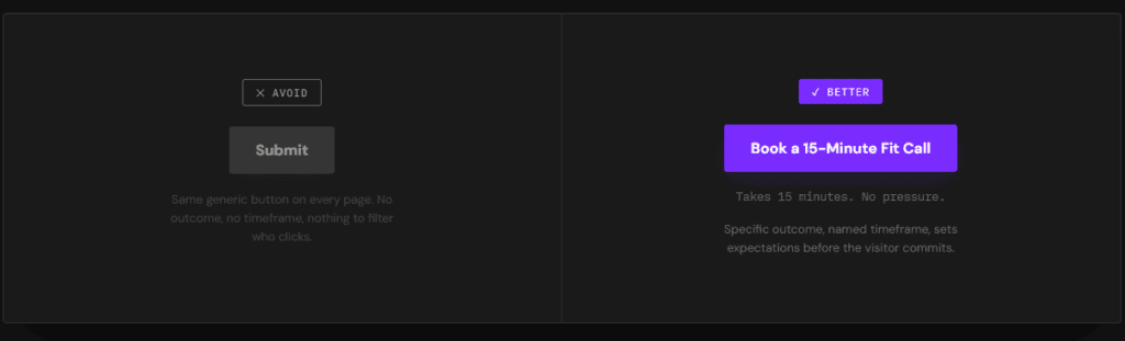
The CTA is generic. “Contact Us,” “Learn More,” and “Submit” describe an action without describing an outcome. They convert browsers and serious buyers at roughly the same low rate, because neither group knows what they’re actually signing up for.
The CTA is repeated without variation. The same button appears at the top, middle, and bottom of every page, regardless of what the visitor has just read. A CTA that ignores context is asking for a decision the visitor isn’t ready to make yet.
The CTA never filters anyone out. Most businesses are so afraid of losing a lead that every CTA is built to capture anyone willing to click. That approach fills the calendar with unqualified calls a sales team then has to filter manually — the exact job better website call to action examples are supposed to do automatically.
15 Website Call to Action Examples for Service Businesses
These website call to action examples are grouped by where a visitor encounters them — because the right CTA changes depending on how much a visitor already trusts you.
Homepage CTAs That Set the Filter Early
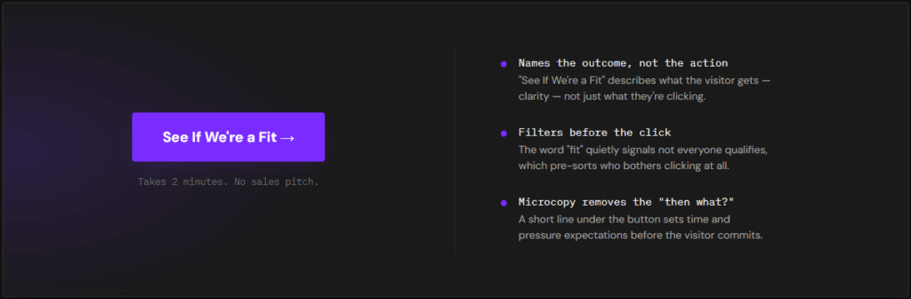
1. “See If We’re a Fit” This does more filtering in four words than most homepages do in four paragraphs. It signals upfront that not everyone qualifies, which makes the visitors who do click feel like they’re being evaluated, not just funneled.
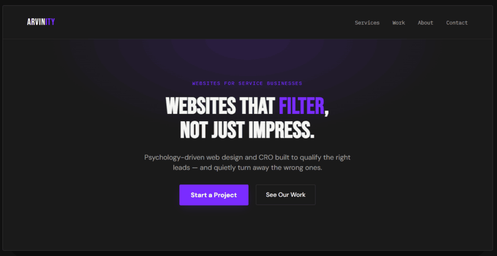
2. “Start a Project” Specific and low-ambiguity — it tells a ready visitor exactly what clicking begins, without the vagueness of “Get Started” or “Learn More.”
3. “Get Your Free Audit” Names a concrete deliverable instead of a vague next step. A visitor knows exactly what they’ll receive, which lowers the hesitation that kills generic CTAs before the click even happens.
Service Page CTAs That Move Visitors Toward a Decision
4. “See Pricing & Packages” Answers the question a skeptical visitor is already asking silently. Hiding this behind a generic “Contact Us” just pushes that same question onto a call your team now has to answer live.
5. “Talk to a [Service] Specialist” Naming the role, not just “us,” makes the next step feel specific and low-risk instead of like a generic sales pitch.
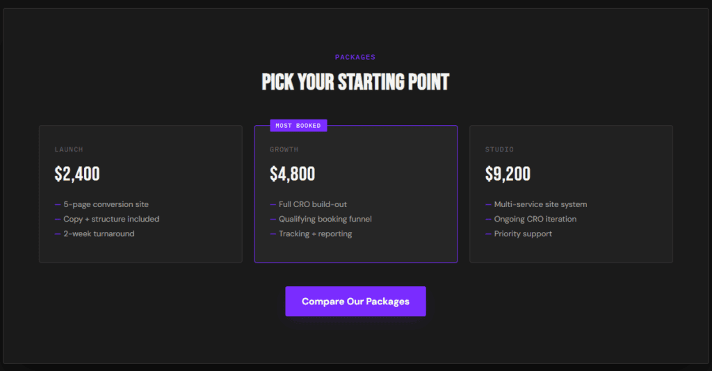
6. “Compare Our Packages” Useful when a service has tiers — it invites comparison instead of forcing a single yes/no decision, which suits a visitor still evaluating options.
Proof-Driven CTAs That Build Trust Before the Click
7. “See the Results” Placed next to a case study or testimonial, this CTA leans on proof that’s already built momentum, rather than asking for trust cold.
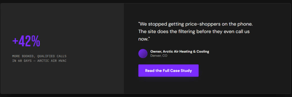
8. “Read the Full Case Study” Gives a curious-but-not-ready visitor a lower-commitment next step than booking a call — and often warms them up enough that they book anyway a few pages later.
9. “See Why [Client Type] Chose Us” Speaks directly to the visitor’s own situation instead of a generic audience, which is one of the more underused website call to action examples on service business sites.
Booking Funnel CTAs That Pre-Qualify Leads
10. “Check Your Project Fits Our Scope” Sets an expectation before the click that not every project is accepted, which pre-qualifies the visitor before they’ve even reached the form.
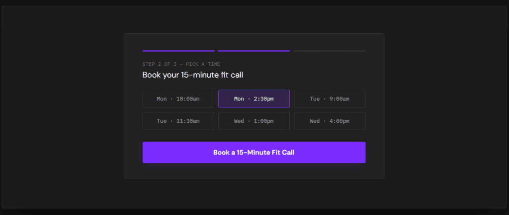
11. “Book a 15-Minute Fit Call” Naming the exact time commitment reduces hesitation more than an open-ended “Schedule a Call,” which visitors correctly assume might run long.
12. “Answer 3 Quick Questions to Book” Sets expectations that a short qualifying step comes before the calendar link — which filters out low-intent clicks without adding real friction for a serious buyer.
Disqualifying CTAs That Filter Out the Wrong Fit
13. “Not Sure We’re a Fit? Check Here First” Directly addresses hesitation instead of ignoring it, and gives an unqualified visitor an honest off-ramp instead of a form they’ll abandon halfway through.
14. “This Isn’t for Everyone — See Who We Work With” One of the more counterintuitive website call to action examples on this list, and one of the highest-converting once you test it: naming who you don’t serve makes the right-fit visitor trust the rest of the page more, not less.
15. “Skip This If You’re Just Comparing Prices” Blunt, but effective. It tells a price-shopper to self-select out before they take up a form submission or a call slot meant for someone who’s actually ready to buy.
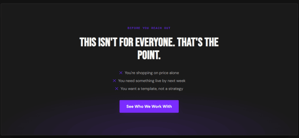
Suggested image: a screenshot of a qualifying or “who this isn’t for” section, or a stock graphic searched as “website filter section design.”
Common CTA Mistakes to Avoid
Even with a strong library of website call to action examples to pull from, a few habits quietly undo the work:
- Using the same CTA everywhere. A homepage visitor and someone who just finished reading a case study are at different stages — one CTA can’t serve both well.
- Burying the CTA below multiple scrolls of copy. If a ready visitor has to hunt for the next step, a percentage of them leave instead of scrolling further.
- Writing CTA copy that describes the button instead of the outcome. “Click Here” and “Submit” tell a visitor what the button does mechanically, not what they get from clicking it.
- Never testing disqualifying language. Most businesses are too nervous to try a CTA that filters visitors out, even though it’s one of the more reliable ways to raise the quality of the leads that do come through.
- Treating the CTA as separate from the copy around it. The sentence right before a button does more persuading than the button text itself — a strong CTA with weak setup copy still underperforms.
- Copying website call to action examples word-for-word without adapting them. The phrasing that works for one business’s audience can fall flat for another — treat every example on this list as a starting point to adapt, not a script to paste in directly.
How CTAs Should Change by Industry
Not every business needs the same website call to action examples word-for-word — the core logic stays the same, but the emphasis shifts:
HVAC and roofing businesses do well with CTAs that address cost anxiety directly — “Get a Free, No-Obligation Estimate” outperforms a vague “Contact Us” because it removes the fear of a hidden sales pitch.
Legal and consulting websites benefit from CTAs that emphasize access and speed — “Talk to an Attorney This Week” answers the responsiveness question a visitor is quietly worried about.
Coaches and consultants need the disqualifying CTAs on this list to work hardest, since high-ticket offers attract more curious browsers than ready buyers — a CTA like “See If You Qualify” filters window-shoppers before they take a discovery call slot.
Agencies and freelancers get the most mileage from proof-driven CTAs, since prospective clients are usually comparing several portfolios before they’re ready to reach out at all.
If you want to see this logic applied to full page structure — not just the CTA — our Service Business Website Blueprint breaks down where CTAs fit into the bigger picture.
Frequently Asked Questions
What’s the best CTA for a service business homepage?
There’s no single best CTA — it depends on how much trust a first-time visitor already has. Looking back at the website call to action examples above, a newer or lesser-known business usually does better with a low-commitment CTA like “See If We’re a Fit” or “Get Your Free Audit,” while an established brand with strong proof can go straight to “Start a Project” or “Book a Call.”
How many CTAs should a webpage have?
One primary CTA per page, repeated in context rather than duplicated identically everywhere. A homepage might repeat “See If We’re a Fit” after the hero, after the proof section, and at the bottom — same core action, reinforced at each point a visitor’s confidence grows.
Do disqualifying CTAs actually reduce leads?
They reduce the number of unqualified leads, which is the point — total lead volume may drop while booked-call quality goes up. It’s exactly why the disqualifying website call to action examples further up this page tend to outperform expectations once businesses actually test them. For most service businesses, fewer, better-qualified calls beat a longer list of quotes and consultations that were never going to close.
Turn These CTAs Into Booked Calls
A great CTA can’t fix a page that gives visitors no reason to trust it — but a weak CTA can absolutely sink a page that does everything else right. These website call to action examples work because each one reduces uncertainty, sets a clear expectation, or filters out the wrong fit before a click even happens. Swap even two or three of these website call to action examples in for the generic ones on your current site, and the difference in call quality usually shows up within the first few weeks.
This is the same qualification logic we build into every psychology-driven web design and CRO project at Arvinity Studio. If your current CTAs are collecting clicks but not booked, qualified calls, start a project and we’ll show you exactly where the filtering is breaking down.
Further reading on how visitors actually make decisions on a page: Nielsen Norman Group and Baymard Institute both publish ongoing UX research on CTA placement and microcopy.