
Corporate Legal Advisory — Full Website Design & Conversion Copywriting
Mercer & Blackwell LLP
How a global outside general counsel firm built a website that reads as world-class and responsive at the same time — a combination most law firm sites can't pull off.


The Story
The Challenge
Outside general counsel firms sit in an awkward positioning gap. On one side, white-shoe firms project prestige but read as slow, bureaucratic, and hard to reach — a General Counsel or CEO signing on with them expects to deal with a junior associate for months before a partner even looks at their file. On the other side, smaller firms and legal templates feel responsive but can't credibly claim the cross-border sophistication a growing company, PE fund, or Series C startup actually needs when they're negotiating a multi-jurisdictional acquisition.
Mercer & Blackwell's actual positioning — nine offices across three continents, direct partner access on every engagement, Fortune 500 and PE-fund clients, a 24–48 hour initial response commitment — is the rare combination of both. But the existing web presence didn't communicate that combination. It read like a standard law firm site: a services list, a mahogany-desk aesthetic, and no clear signal that this firm was actually faster and more accessible than its "world-class" positioning implied.
The deeper problem was who was actually reading the site. A General Counsel, founder, or PE managing director evaluating outside counsel isn't browsing casually — they're assessing risk. Every unclear practice area, vague credential, or generic stock photo reads as a small signal that this firm might not actually be equipped for a cross-border acquisition or a GDPR-scale compliance problem. In a category built on trust and precision, ambiguity is disqualifying.
The Strategy
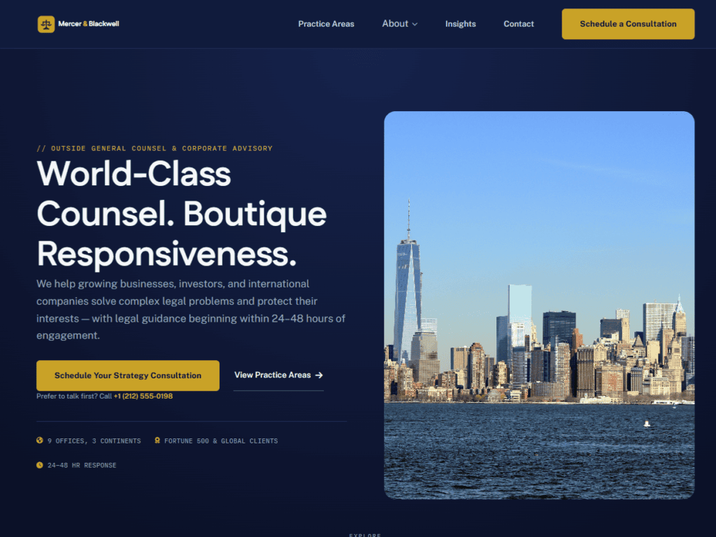
The insight driving the rebuild: Mercer & Blackwell's differentiators are genuinely rare and highly specific — they just needed to be led with, not buried in a paragraph. The homepage opens with hard numbers instead of a mission statement: nine offices, three continents, Fortune 500 and global clients, a 24–48 hour response commitment. A risk-averse decision-maker can qualify the firm's credibility in the first five seconds, before reading a single sentence of copy.
Right after that credibility signal, the site names the actual cost of reactive legal counsel — the unreviewed clause that costs millions, the generic contract template that doesn't hold up, the regulatory exposure that compounds with every new jurisdiction. This is the same pain-point-first structure we use across every industry: name the buyer's real fear before asking for anything, so the pitch that follows reads as informed rather than generic.
Every section after that was built to answer one specific objection a sophisticated buyer would have: fourteen distinct practice areas instead of a vague "corporate law" catch-all, transparent partner-to-associate rate tiers instead of "contact us for pricing," and a clear three-step engagement process so a prospective client knows exactly what happens after they reach out.
The Design Approach
Most law firm websites default to the same visual cues — navy and gold color schemes, scales-of-justice iconography, and stock photography of a handshake over a conference table. That look reads as competent but interchangeable; it doesn't communicate "boutique responsiveness" at all. Mercer & Blackwell's site uses the same dark, editorial palette as the rest of the Arvinity Studio portfolio — restrained, confident, and closer to how a top-tier PE fund or fintech presents itself than how a traditional law firm does.
The specificity throughout — $900–$1,600/hr partner rates stated plainly, 24–48 hour response time repeated at every decision point, nine offices named rather than implied — is itself a design decision. Vague reassurance reads as marketing. Specific numbers read as a firm that has nothing to hide from a buyer who is, by profession, trained to look for exactly that.
How We Built It
Concept Build
Buyer Psychology Mapping
Mapped the decision journey of a General Counsel, founder, or PE managing director evaluating outside counsel — the specific credibility signals and risk-aversion triggers that determine whether a firm gets shortlisted at all.
Conversion Copywriting
Wrote every page before designing a single layout. Credibility-first hero framing, the reactive-counsel cost section, and transparent fee messaging were all established in words first, then translated into design.
High-Fidelity Design
Built a premium editorial identity that deliberately breaks from navy-and-gold law firm convention — dark palette, restrained typography, and a visual register closer to a PE fund's site than a traditional firm's.
Full Site Architecture
Built out 11+ pages — home, practice areas, about/team, global offices, case studies, insights, insight detail, contact, strategy consultation, privacy policy, and terms of use — with consistent messaging hierarchy across every touchpoint.
Mercer & Blackwell ran our cross-border acquisition from start to finish and consistently flagged issues before they turned into real costs. It felt less like hiring outside counsel and more like adding a legal team that already understood our business.
Ready to stop filtering manually?
Let Your Website Do the Qualifying.
Submit your project details and Arvin will personally review your site — then send a clear, honest breakdown of what needs to change, and what a conversion-first build looks like for your business, within 48 hours.